

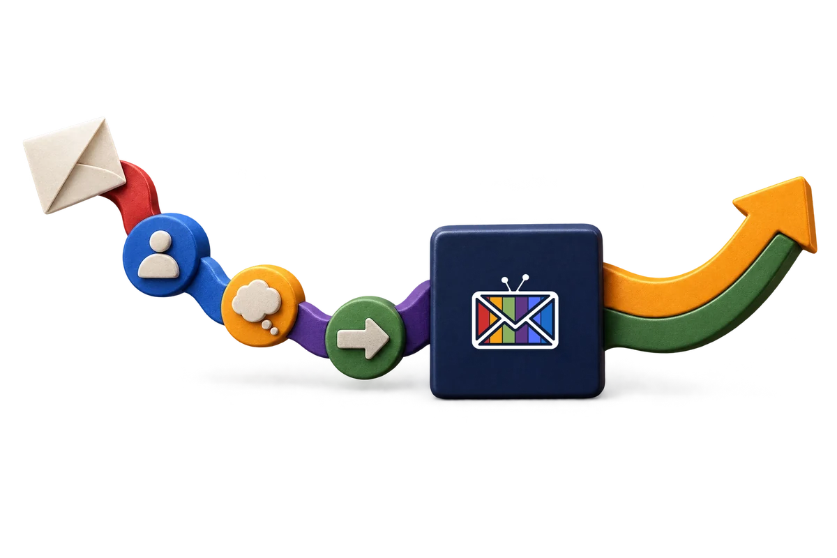
A visitor can like what they see and still leave without getting in touch. Often the problem is not one dramatic broken page. It is a series of small handoffs where the next step becomes harder than it needs to be. Here is a practical way to look for those moments.
01
Can they recognise themselves?
People rarely arrive wanting to admire a website. They arrive with a problem, a decision or a question. If your first screen describes only what your business does, they still have to work out whether it is for someone like them.
Start with the situation your best-fit customer already recognises. Then explain the practical result of solving it. You do not need a louder claim; you need a clearer connection between their problem and your work.
The useful question: Could a first-time visitor say, in their own words, who this is for and why they might care?
02
Can they see a sensible next step?
The journey should not demand the same commitment from every visitor. Someone comparing approaches might want a real example. Someone with a specific project might want a relevant conversation. Someone unsure where to begin might need a useful diagnostic first.
Put those routes in language that describes what happens next. “Book a conversation about your website” is easier to understand than a button that sends everybody into a generic audit. Explain whether a first step is free or paid before they have to choose it.
A quick route check
- Can a visitor find a real example without searching the menu?
- Does each service page offer the next action for that service?
- Does the button lead where its wording says it will lead?
03
Is the proof near the decision?
A beautiful screenshot tells someone what a project looked like. It does not, on its own, show the business question behind it, the choices that shaped it or what a client learned. Give the visitor enough context to understand why the work matters.
If you have an approved testimonial or outcome, attribute it and explain its scope. If you do not, say what was designed and show the real work. Clear process and concrete examples are more persuasive than numbers that cannot be checked.
The editorial rule: Show what you can stand behind. Label examples as examples. Do not make a screenshot carry a results claim it cannot prove.
From the studio: See the actual work. Browse live websites and diagnostic experiences rather than a wall of invented results.
04
What happens after they ask?
A submitted form or a booked call should lead somewhere useful. If their message arrives without context, your team has to start from zero. If nobody knows who owns the response, a promising enquiry can wait while the momentum fades.
You do not need to automate every conversation. You do need to know where an enquiry lands, what the person has already told you and what a helpful reply should do. That can be a simple human process first and a connected system later.
Look at the handoff
- Where does each enquiry arrive, and who can see it?
- What useful context travels with it?
- Is there a clear next action if the first conversation is not the right one?
Go a step further: See Kick Ass Follow-Through. Our approach to making the conversation useful after someone raises a hand.
05
Find one break. Fix that first.
Walk your own website as someone meeting the business for the first time. Start at the page they are most likely to land on. Ask what they understand, what proof they can reach and where a real enquiry would go. Then follow that enquiry into your own process.
Write down the first moment where you have to guess. It could be an unclear offer, a weak example, a generic call to action or a follow-up nobody owns. That is a better first improvement than changing everything at once.
Take this away: More useful journeys come from connecting the moments that matter, not just making every individual screen look better.